And the Oscar for best movie poster design goes to...?


Moonlight, Manchester by the Sea, Fences, Lion, Hacksaw Ridge, Hidden Figures, La La Land, Hell or High Water and Arrival were all nominated for best picture at the Academy Awards this year, but which of the posters for this year’s top movies is worthy of the coveted gold statue?
Much like any branding or communications, designing a memorable movie poster is a tough nut to crack.
With only a single image to play with, it needs to grab the attention, entice at a glance while encapsulating the spirit of the film. Think 'The Godfather', 'Jaws', 'Westside Story' and 'Back to the Future' – all iconic, all memorable, all draw you in and all give you a taste of what to expect. And all worthy of being pinched and pinned onto a bedroom wall… (see The Drum's comparison of the Trainspotting and T2: Trainspotting poster campaigns here).
Martin Grimer, executive creative director at Aesop Agency, took a look to see what this year’s Oscars contenders have to offer and which, if judged on the ‘performance’ of the poster alone, would walk away with the trophy.
Arrival

A moody horizon, a UFO that doesn’t look like a UFO, a helicopter, some ‘alienesque’ expanded typography and a headline saying ‘Why are they here?’ A clever localised campaign across the world.
I immediately got the set up, it’s kind of intriguing as the UFO looks like a big exclamation mark, but overall there’s nothing particularly fresh here.
La La Land

This one immediately grabbed me with its Technicolor, hyperâ€real aesthetic, a nod to the glamour of musicals past but with a twist. Beautiful typography, ranged left, emphasizes the La La La, and it has an interesting visual composition; the lamp post on the right reminiscent of 'Singing In The Rain', the pop of her yellow dress against the deep blue night sky over LA. There is a clear sense of the story and visual world to come †definitely a contender.
Fences
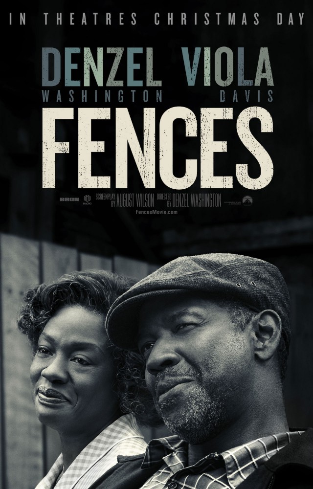
I struggled to find much to say about this one. It feels very editorial – more book cover than movie poster. A black and white still from the film, a bit of textured text – it doesn’t give much away.
Hacksaw Ridge

I was grabbed by the lovely illustration on this one †a soldier carrying a soldier, emerging from the smoke and ashes of war.
It further rewards on closer inspection; the soldier being carried has a gun in hand, the soldier carrying has an overlaid small graphic red cross. Although a tried and tested composition it feels quite iconic.
Hell of High Water
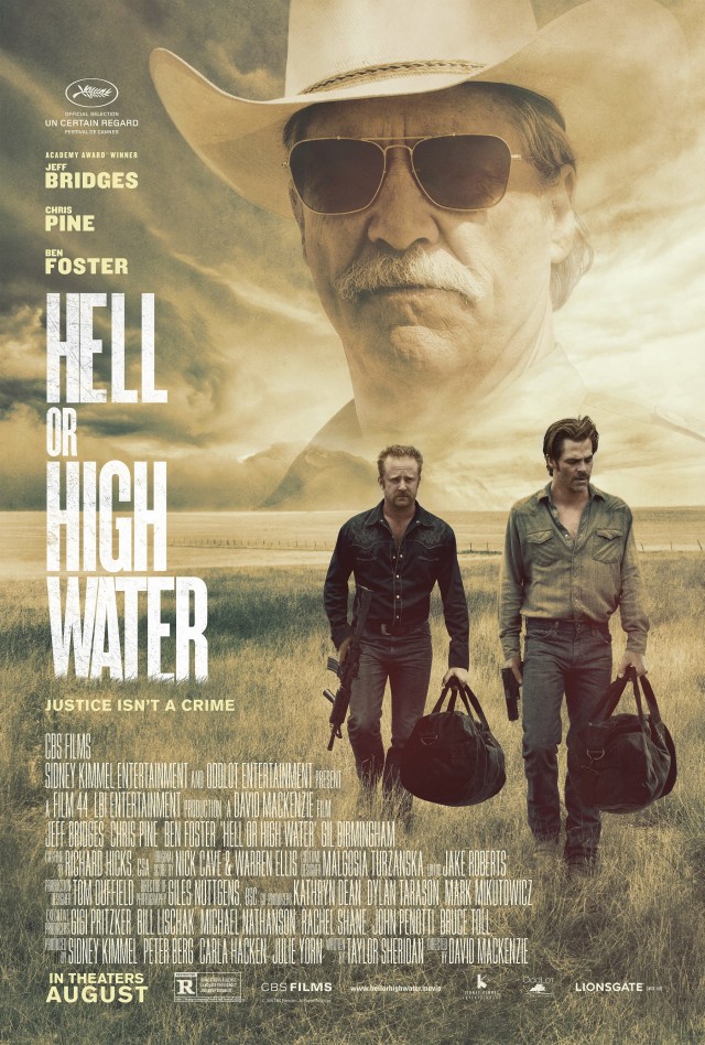
A familiar visual set up we’ve seen many times before with overlaid imagery that was de rigueur for 80s film posters. I guess however it does prompt the story -†Sheriff searching out the crims and the ultra condensed typography ranged left adds some drama.
Hidden Figures

On first glance I got a 9 to 5 or First Wives Club edge to this poster †empowered women strutting their stuff. But it’s too hammy for what is an important true story of three black women that helped launch the first successful space mission through their data finding talents.
You can feel the hand of the studio at play here – trying to inject a feel-Ââ€good buddyÂâ€movie vibe. Ultimately it’s just too ‘story by numbers’ – it deserves something less clichéd.
Lion
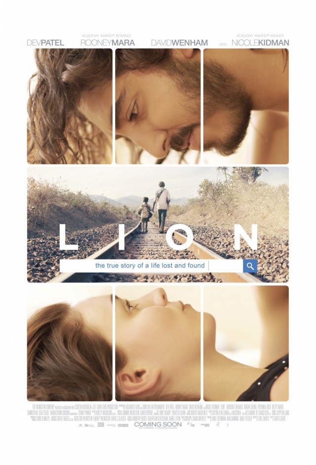
A tragic tale of family separation which the poster attempts to visually bring to life through separations of the imagery held in a grid, with the central image of a train track being key to the story.
A nice idea but somehow too bland and passive for such a powerful story. An opportunity missed.
Manchester by the Sea

Great film – dull poster. Feels like a snapshot of real life and relationships which is tonally appropriate but suffers with a moody, ‘Indy’ feel that fails to compel visually.
Moonlight
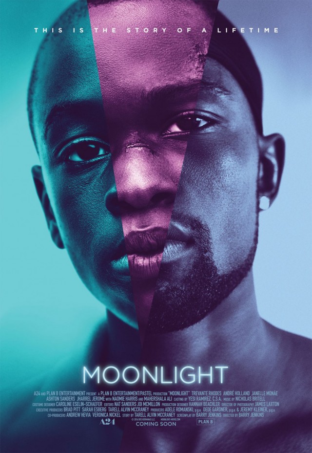
The simple iconic image of a face and piercing eye contact. Three images spliced together to depict the journey of a fractured life and repressed sexuality, from child to adulthood †like looking into a shattered mirror.
Simple typography with a subtle glow, a shaft of pink light beams from the type to lead you up to the image. A fresh use of colour, Âpink, turquoise and blue beautifully reflecting the moonlight in a totally contemporary way.
And the winner is…
Moonlight.
Overall, this one tells its story in the most interesting, arresting way. It doesn’t feel obvious, it doesn’t spell out the brief and tell you exactly what you’re going to see. It feels truly unique through its bold simplicity, fractured imagery and use of colour.
La La Land comes in a close second †it’s a lovely poster and I like the contemporary nod to the glamorous days of old musicals.
And in third place I would put Hacksaw Ridge, certainly a more traditional composition but satisfying nonetheless.
http://www.thedrum.com/opinion/2017/02/02/and-the-oscar-best-movie-poster-design-goes
Comments
Fair enough, then go here and vote