I hope you used an appropriate era crayon for added authenticity.
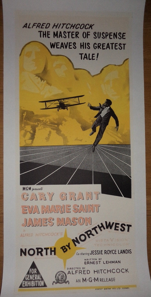
Well, I didn't use the brightest red crayon to match the original colour because the Mount Rushmore heads have faded slightly but not to the extent as the red lettering.
I also touched up the arrows and the bold outline of the North by Northwest. Which didn't really show up in the photo but the Vista Vision Technicolor did.
Ok, got a question here. Have you used a small water brush pen with a fine tip over the top of a touch up to give it a more blended mix on the paper? Does it look smoother if you know what I mean?
Might test it first on a crappy poster. I like the idea of the small fine brush and being able to control the amount of water for those delicate smaller areas.
I have used brushes with water, but really only to soften the color (from the water color pencil) if I'm having problems matching.
Not sure if it harms the poster in the long run since adding more water would just remove the color.

Comments
Glad it was you (even if it is the re-release)
And I think you were wise to keep the colouring very subtle
:-$
This is also true with Audrey Hepburn posters!
Here is a handy checklist to help tell eMoviePoster.com apart from all other major auctions!
original:
At least seller says it was heavily restored....
http://www.ebay.com/itm/WINGS-Original-Window-Card-1927-14X22-CLARA-BOW-MOVIE-POSTER-LOBBY-PARAMOUNT-/181480662325?pt=LH_DefaultDomain_0&hash=item2a41172535