Skip to content

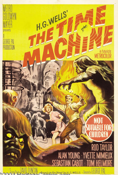
Great Poster but just wee too much Yellow for my liking.

Had a chat Ves this afternoon and this topic always seems to pop up in our discussion.

So I'd like to know what others think and it doesn't have to yellow. It can be any other colour as well.

Here's a couple of examples of what we talked about.

Time Machine Australian one sheet.


House on Haunted Hill Australian one sheet


«1

Comments

  • Let's be more accurate...there is sometimes too much yellow :)

    Apparently this one has just enough yellow:


  • The one sheet for My Fair Lady has too much pink for my liking:


  • This Gentlemen Prefer Blondes Aub Mosely designed 1953 daybill immediately sprang to mind. Too much yellow for me.
  • OTOH, this poster is great BECAUSE it has "too much blue"!


    Here is a handy checklist to help tell eMoviePoster.com apart from all other major auctions!
    HAS lifetime guarantees on every item - IS eMoviePoster.com
    HAS unrestored and unenhanced images - IS eMoviePoster.com
    HAS 100% honest condition descriptions - IS eMoviePoster.com
    HAS auctions where the winner is the higher of two real bidders - IS eMoviePoster.com
    HAS "buyers premiums" - NOT eMoviePoster.com
    HAS "reserves or starts over $1 - NOT eMoviePoster.com
    HAS hidden bidder IDs - NOT eMoviePoster.com
    HAS no customer service to speak of - NOT eMoviePoster.com
    HAS "nosebleed" shipping charges - NOT eMoviePoster.com
    HAS inadequate packaging - NOT eMoviePoster.com

  • Bruce said:
    OTOH, this poster is great BECAUSE it has "too much blue"!


    It is a wonderful poster! I love blue...
  • HONDO said:


    This Gentlemen Prefer Blondes Aub Mosely designed 1953 daybill immediately sprang to mind. Too much yellow for me.
    I think that yellow paint must have been in abundance.  Its EVERYWHERE!
  • edited March 2021
    The blue face is a bit ridiculous.


    And more yellow.....


  • Oh man!  That's a lot of YELLOW!  Great portraits though!


  • Shane Australian one sheet and The Facts Of Life daybill designs with too much yellow applied for my taste.
  • Agree with the color overload-but think it’s worse when things are colors they shouldn’t be; the faces in Shane & Married Boss I think hurt the appeal of the poster. 

    In Rear Window there’s a lot of red, but the stars faces are “natural” in tone. 

  • edited March 2021


     ;) 
  • edited March 2021

    That daybill  image appears to be of The Spider Woman Strikes Back ( 1947 ). The only copy of that film that I have ever seen. It would be nice to view an unadulterated copy image of this film.


    The U.S.A. insert of the film for comparison. 


  • How about the green and the blue then that was applied to these Pygmalion posters?


  • This Rio Bravo Australian one sheet is a disaster and hard on the eyes. Anyone agree?
  • HONDO said:


    How about the green and the blue then that was applied to these Pygmalion posters?
    I dont mind the one on the left...
  • HONDO said:


    This Rio Bravo Australian one sheet is a disaster and hard on the eyes. Anyone agree?
    Need my sun glasses to look at this one!


  • A John Wayne below par coloured poster is Jet Pilot ( 1957 ). I am of two minds with Passage To Marseille ( 1944 ). Do the red and yellow colours work? I am not sure, but some tonning down of the red colour I am convinced  would have made it a better poster.

    That's all folks!

  • Wow , a few more posters coming out of the woodwork than expected. 

    Poor old John Wayne getting wacked by our artists. Hondo nailed it with Rio Bravo Might need another thread to recover some pride.

     Hondo, The Spider Woman Strikes Back ( 1947 ) for Chris's poster. Any other info do you have on that?
  • edited March 2021
    Matt said:
    Wow , a few more posters coming out of the woodwork than expected. 

    Poor old John Wayne getting wacked by our artists. Hondo nailed it with Rio Bravo Might need another thread to recover some pride.

     Hondo, The Spider Woman Strikes Back ( 1947 ) for Chris's poster. Any other info do you have on that?
    I worked out the film's title from the recognisable images of  Rondo Hatton  and the spider web. I then thought the film was The Spider Woman Strikes Back and on checking the U.S.A. insert then found the images on this poster, including the Gale Sondergaard one then confimed this to be the film.

    One has to wonder how this inferior daybill copy wasn't spotted and scrapped at either the printers or at the Universal offices. Amazing to know it ever ended up surviving. It would be interesting to see if Chris knows anything more regarding this poster's history. 

  • This Spider Woman daybill is made odder by the fact it is printed on the back of a normal Sinister Shadow daybill! 
  • Both of course starring Rondo Hatton

  • edited March 2021
    Also although I am probably a bit biased I think the Passage to Marseille is one of the most striking Warner Bros daybills!  It is even more appealing in person. I really love it
  • Rio Bravo is a shocker
  • This Spider Woman daybill is made odder by the fact it is printed on the back of a normal Sinister Shadow daybill! 

    What is the image condition of The Sinister Shadow daybill?   Is anything of The Spider Woman Strikes Back image visible on this side of the poster? Can you please share an image?


  • Also although I am probably a bit biased I think the Passage to Marseille is one of the most striking Warner Bros daybills!  It is even more appealing in person. I really love it


    Australian daybill and the similar U.S.A. insert. 
  • HONDO said:


    Also although I am probably a bit biased I think the Passage to Marseille is one of the most striking Warner Bros daybills!  It is even more appealing in person. I really love it


    Australian daybill and the similar U.S.A. insert. 
    The HA image seems washed out - the colours really pop much more in person (ok I think I have convinced everyone now ;) )
  • HONDO said:
    This Spider Woman daybill is made odder by the fact it is printed on the back of a normal Sinister Shadow daybill! 

    What is the image condition of The Sinister Shadow daybill?   Is anything of The Spider Woman Strikes Back image visible on this side of the poster? Can you please share an image?
    Nope nothing shows through.  In fact I had had the Sinister Shadow daybill for years without even noticing the second printing on the back!

    I don't know why I only have a crappy photobucket copy but oh well:


  • The above original Casablanca Australian one sheet I believe got the background colours just right


    The Australian Casablance first release daybill, although a lovely poster, could have toned down the red backgroud just a little. Anyone agree?
  • edited April 2021

    No thoughts on the colour presentaations of the two Casablanca posters?
  • I quite like the red, though i usually find Marchant posters less attractive.
Sign In or Register to comment.


Logo

For movie poster collectors who know...

@ 2025 Vintage Movie Posters Forum, All rights reserved.

Contact us

info@vintagemoviepostersforum.com

Get In Touch