Best Of
Re: F. Cunninghame - Fugly or Not?
Absolutely agree and thanks for commenting.Bruce said:That daybill is a complete miss in my humble opinion
 HONDO
HONDO
1
Re: Wow - What A Difference A Country Can Make In Poster Design

Human Desire ( 1954 ) U.S.A. one sheet.


Two Human Desire Italian posters.These Italian posters do it for me.
xxxxxxxxxxxxxxxxxxxxxxxxxxxxxxxxxxxxxxxxxxxxxxxxxxxxxxxxxxxxxxxxxxxxxxxxxxxxxxxxxxxxxxxxxxxxxxxxxxxxxxxxxxxxxx

The Lady Vanishes ( 1938 ) U.S.A. one sheet

The Lady Vanishes ( 1938 ) Argentinean poster. Although a misleading poster image I prefer this one.
 HONDO
HONDO
1
Re: Where Are These Daybills?
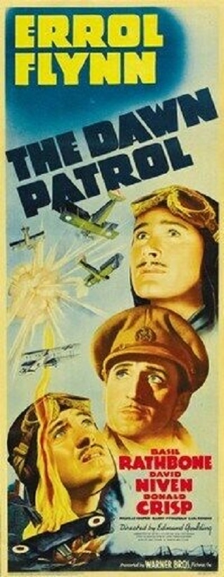
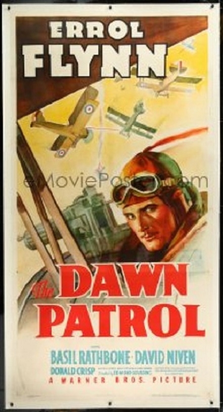
I am hoping that the original Australian daybill would have resembled either the below U.S.A. insert or 3 sheet.collectahollic said:Indeed Lawrence. I'm hoping that with Errol Flynn being a local talent, more effort would have been put into his daybill design


 HONDO
HONDO
1
Re: Which Are Your Favourite 'B' Team Artwork Monster Daybills?
Much more than you originally would have paid for it i would suspect.Rick said:what do you reckon my crazy Godzilla would be worth, and the others for that matter?I love these bad posters!cheersrick
With the interest shown here on the forum alone. a nice little bidding war would certainly take place if Bruce was to ever auction one.
 HONDO
HONDO
1
Re: M-G-M Logos Used On Australian Daybills In The 1960s.
Very truededeposter said:I don't think there was a lot of quality control for Australian posters in those years. Many of them had shoddy artwork so I think logo placement and usage was probably the last thing they were worried about. It's. shame when you compare them with earlier posters from the 30s and 40s which generally are pretty amazing.
 John
John
1
Re: M-G-M Logos Used On Australian Daybills In The 1960s.
100% agree with you. I would also include as well as 1930's and 1940's posters some early 1950's posters.dedeposter said:I don't think there was a lot of quality control for Australian posters in those years. Many of them had shoddy artwork so I think logo placement and usage was probably the last thing they were worried about. It's. shame when you compare them with earlier posters from the 30s and 40s which generally are pretty amazing.
The quality really went on a downhill spiral in the 1950's with the imput of the F. Cunninghame and Robert Burton printers leading the way,
 HONDO
HONDO
1
Re: A Do You Know Your Classic Movies Quiz.
Haha! Some places haven't changed, I've never been able to spot Graham Kennedy as an extra in the film though. Apparently he's in a scene in Flinders Street outside the old Classic Restaurant. I once worked with a guy who had the director's chair of Fred Astaire. I'd love to know what happened to it.
Thanks for sharing your thoughts Peter. The director's chair would be cool.
 HONDO
HONDO
1
Re: Should I linen back an old poster?
If it doesn't need any restoration, I wouldn't get it backed. My two cents


