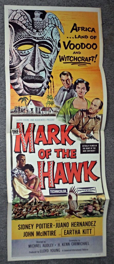
Racism Or Incompetence in the artwork of the Australian 1957 daybill Mark Of The Hawk?

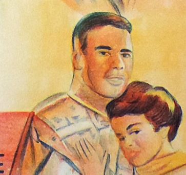
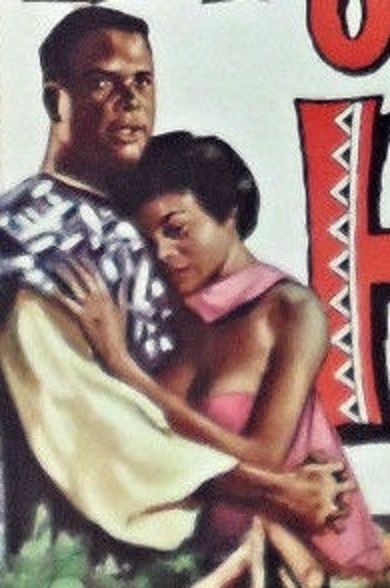
While organising my '' Name The Stars Of The 1950's Quiz'' I came across a daybill of Mark Of The Hawk with some of the actors images poorly drawn.I was inclined to have a look at the excellent U.S. artwork to compare. The Australian daybill, apart from the actor John McIntire's image making him look ten years younger and not very much like him and reminding me of George Sanders, I found the image of Sidney Poitier and Eartha Kitt.surprising in it's depiction. Have a look at the daybill image and compare it to the U.S.Insert image to see what I mean.
Was the artist intending on purpose to alter the colour and appearance of the negro stars to look caucasion or was it just a case of unintentional poor artwork by a poster artist working for F. Cunninghame who were known for producing some of the worst daybill design ever for Universal between 1954 & 1960? The majority of the images on ''Name The Stars Of The 1950's Quiz'' showing almost to complete unrecognisable images were drawn by F. Cunninghame poster artists.
Was it the former or the latter? Any thoughts?

Hondo
Comments
You are stating the obvious.
Hondo
Sidney Poitier & Eartha Kitt are dark skinned. Their images on the Australian daybill poster artwork are not dark skinned but at best look light skinned negros with generations of intermarriage in their family history. Part of the inspector's face, and he is supposed to be white, is in part the same colour as the couples is. The image of Sidney Poitier to me looks nothing like him and only a little likeness for Eartha Kitt.
I am not saying what I believe to be the reason behind the drawing of the couple whether it being done intentionally to alter their appearance from black to look more like white or just the poor drawing skills by the poster artist and possibly not helped in the printing process.
Hondo
Like tar and feathering repeat I like to repeat myself.
Hondo
=D>
Seeing I raised this topic to see what reaction I would get with something that crossed my mind at the time I now wish to publicly state I firmly believe and always have that it wasn't racism but solely poor artwork by the poster artist at F. Cunninghame for the Mark Of The Hawk daybill they produced.
It is commonly thought Robert Burton had the worst poster artists when it came to daybills & one sheets but no it was definitely F. Cunninghame who greatfully ceased producing film posters in 1960.I have sited some great artwork from the 1930's. fair to good 1940's work but very little quality from their period of shame the 1950's with the majority poorly drawn.
Hondo