This is bad. Re-issue poster of The Great John L. The likeness of Linda Darnell is underwhelming to say the least. This daybill must rank as one of the worst I have seen.
This is Linda Darnell's image taken from a U.S. The Great John L lobby card. This is the image or something similar that the Australian artist ( if we can say this without laughing ) would have had to work from. The alternative explanation is the artist had no artwork at all and was told to draw an image of a boxer and Linda Darnell and this is the result.
If you think the daybill poster images are bad and you are haven't visited my thread titled Name The Stars Of The 1950's Quiz it's worth a visit to see how badly drawn were a lot of the 1950's daybills.
It's nice to see a balance between the good and the bad daybill artwork.. Have a look at the W.E.Smith, Marchant & Co. and Chromo Print and you will see examples of why people love daybills.
It's nice to see a balance between the good and the bad daybill artwork.. Have a look at the W.E.Smith, Marchant & Co. and Chromo Print and you will see examples of why people love daybills.
Hondo
Loving the daybill threads , it'd made me add some to my want list. Whereas I used to buy a poster for the movie I now want them for the artwork... stone litho and saturated colours are attractive. Hence me buying captain Clegg daybill!
I will post a worst artwork from a daybill tonight
Loving the daybill threads , it'd made me add some to my want list. Whereas I used to buy a poster for the movie I now want them for the artwork... stone litho and saturated colours are attractive. Hence me buying captain Clegg daybill!
I will post a worst artwork from a daybill tonight
Love Captain Clegg ( aka Night Creatures ) myself and Sven have you noticed on the printer's credits at the bottom after Advertising & Commercial it shows fa0741 and have you wondered what that stood for?
If you don't know already fa0741 is a primary ( Red ) colour that has numerous harmonious colour schemes to choose from. A. &. C. printed daybills using and crediting fa0741 in the early 1960's for various studios daybills. Other great examples of using this colour are Cape Fear, Lonely Are The Brave, The Outsider, The Phantom Of The Opera, Splendor In The Grass.
Looking forward to your example of some bad daybill artwork.
I have never seen those numbers on the poster before (or more to the point, noticed them) but I don't believe #FA0741 is a primary colour; a primary colour is one without any mix of other colours to achieve that colour which would make #FA0000 as the primary colour (Red) - Green is #00FF00 and Blue is #0000FF.
#FA0741 appears to be a good base colour where it can be shaded by adding black to achieve some excellent (moody) results, here some variations of FA0741 by simply adding black
fa0741 hex colour is comprised of Red,Green & Blue. This colour has a CMYK color model, used for the printing process that consists of Cyan, Magenta, Yellow and key (black ).
Sorry I can't find where I originally read and noted that it was a primary colour.
Whatever the correct category fa0741 falls under I have at least brought it to your attention
No but I'll find a photo of my Godzilla which is even `better'
I have three duotone daybill images but this one takes the cake. The friendliest monster you would ever wish to meet. It this the one you mentioned Rick?
Comments
That is one of the reasons I posted the daybill .The US insert does show the difference.
Hondo
This is bad. Re-issue poster of The Great John L. The likeness of Linda Darnell is underwhelming to say the least. This daybill must rank as one of the worst I have seen.
This is Linda Darnell's image taken from a U.S. The Great John L lobby card. This is the image or something similar that the Australian artist ( if we can say this without laughing ) would have had to work from. The alternative explanation is the artist had no artwork at all and was told to draw an image of a boxer and Linda Darnell and this is the result.
Hondo
I think the re-issue posters are in a league of their own...not quite sure what "sport" they are playing.
I still think that the crap-tastic-ness of them in a whole collection would be awesome to behold!
If you think the daybill poster images are bad and you are haven't visited my thread titled Name The Stars Of The 1950's Quiz it's worth a visit to see how badly drawn were a lot of the 1950's daybills.
Hondo
This is pretty bad ...
.
It's nice to see a balance between the good and the bad daybill artwork.. Have a look at the W.E.Smith, Marchant & Co. and Chromo Print and you will see examples of why people love daybills.
Hondo
Sven said
Love Captain Clegg ( aka Night Creatures ) myself and Sven have you noticed on the printer's credits at the bottom after Advertising & Commercial it shows fa0741 and have you wondered what that stood for?
If you don't know already fa0741 is a primary ( Red ) colour that has numerous harmonious colour schemes to choose from. A. &. C. printed daybills using and crediting fa0741 in the early 1960's for various studios daybills. Other great examples of using this colour are Cape Fear, Lonely Are The Brave, The Outsider, The Phantom Of The Opera, Splendor In The Grass.
Looking forward to your example of some bad daybill artwork.
Hondo
fa0741 hex colour is comprised of Red,Green & Blue. This colour has a CMYK color model, used for the printing process that consists of Cyan, Magenta, Yellow and key (black ).
Sorry I can't find where I originally read and noted that it was a primary colour.
Whatever the correct category fa0741 falls under I have at least brought it to your attention
.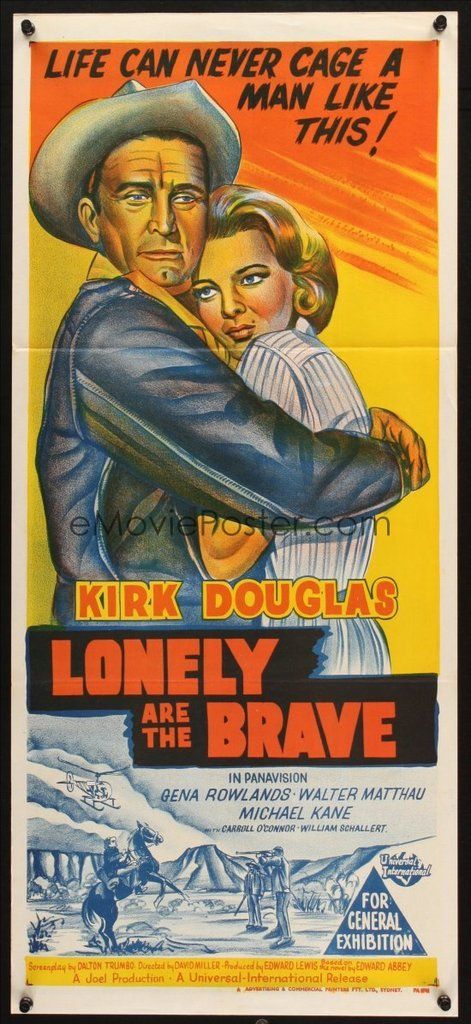
.One of the best examples of fa0741
Hondo
It is from the rare Australian one sheet of The Endless Summer. It does not appear on the daybill. Is it yours Sven?
Hondo
The Destroy all Monsters certainly is fun. You probably will like this one Rick.
Hondo
I have three duotone daybill images but this one takes the cake. The friendliest monster you would ever wish to meet. It this the one you mentioned Rick?
Hondo