Akiko Stehrenberger

The first was written in 2010 by Adrian Curry
Movie Poster of the Week: An Interview with "Funny Games" Poster Designer Akiko Stehrenberger
Written by Adrian Curry
Published on 15 January 2010

I was thrilled to get an email this week from Akiko Stehrenberger, the designer of my favorite movie poster of the last decade. She had been told by friends about her chart-topping appearance and agreed to do an interview for this column. Akiko is an illustrator and art director who lives in L.A. and has been designing movie posters since 2004.
***
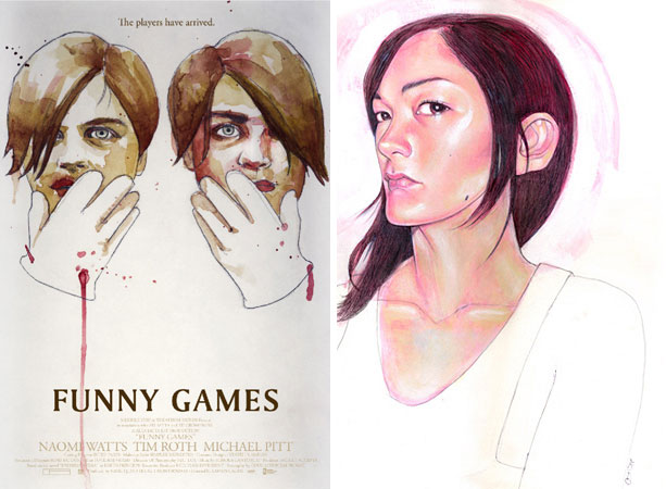
ADRIAN CURRY: First of all, the one thing I've always found most alluring about the Funny Games poster is that I’ve never been quite sure whether it’s an illustration or a photograph.
AKIKO STEHRENBERGER: You are correct in not being sure. It is a digital illustration with a ton of noise on it to roughen it up. Warner Independent expressed interest in a certain scene from the film. We had such an incredibly limited budget that there were no resources to get a hi-res film grab. I literally sat at my personal computer and, in slow motion, chose a frame from the movie I thought would work best. I worked off a very tiny dvd screenshot, maybe 4"x4" and 72 dpi at best and used it as the base. With a background in illustration, and a stubborness for painting tangibly for many years, it was the first time I had decided to illustrate digitally, but I felt it was appropriate.
CURRY: Did you want people to think it was an illustration or a photograph, or was that deliberately unclear? It always reminded me of a Photorealist painting, like an early Chuck Close.
STEHRENBERGER: It sort of spontaneously took a life of its own. It was clear from the get go that the DVD screen grab was unusable as is. The client mentioned that we may eventually have access to a hi-res film pull, but I knew if I wanted it to have a chance, especially while being presented with a plethora of other polished posters by other designers, I knew I was going to have to put some serious magic into it. At first I was just going to try to retouch the screen grab blown up to a poster size, but clearly it was impossible. Next thing I knew, I became obsessed with digitally painting it, and it became what you see today. The look is what drew people to it. And while the client could have used the digital illustration as a place holder until there was eventual access to the film grab, it's the look the client ended up taking and running with.
CURRY: As much as the image, I’ve always loved the spare use of type in the poster. Were you responsible for the whole design, including the typography, and did you have fights with the studio about keeping the type so minimal?
STEHRENBERGER: I was responsible for the design, even though the first version had the type at the bottom. The stacking was influenced by Swiss graphic designer Josef Müller Brockmann, and a need to conserve space so the image could really do its thing. Luckily, the studio wasn't against its minimalism...which never happens. I was lucky to also have my creative director for that job, Jon Manheim, who is a major type enthusiast, to really fight for the type layout.
CURRY: To backtrack a little, how did the commission come about and what was the process? Did you come up with other designs for the film?
STEHRENBERGER: I was a freelancer art director at that time, and Crew Creative, who was my vendor for this particular job, had the relationship with Warner Independent. Jon Manheim, the creative director, approached me knowing that indie and dark/creepy imagery was sort of my forte at that time. I did come up with other designs for this job, including the acrylic illustration of the two men and their white gloves that I have on my website.
Above: Akiko's unused design for the poster, and a self-portrait.
I fought really, really hard for Funny Games to come out the way it did. I don't think I ever fought harder for any of my designs. The client kept wanting to add something to it, like a gloved hand, or blood, and I believed strongly that it was strong enough and haunting on its own. I almost walked away from it entirely at one point, because I really felt adding something would take away its authenticity to the film and make it too “movie postery.†They also wanted me to build a sister piece with Tim Roth. Luckily, they realized the original was strong enough to survive on its own. And with that, we ended up with my favorite poster I created to date!
CURRY: I have a vague feeling that I’ve seen the Tim Roth version somewhere, or did I just dream that? Was it ever made?
STEHRENBERGER: I don’t think it ever made it to become one of the final posters. I did have to do a few versions of it, however. I was so relieved when they decided to nix it though, because I really felt the Naomi one stood strong on its own.
CURRY: Was your poster used at the same time as the white poster with Michael Pitt and Brady Corbet or did one supercede the other? Or were they used in different markets?
STEHRENBERGER: These both became the final posters and were completed around the same time. I think my Naomi one was released on IMPAWARDS first though to get some buzz.

CURRY: Was the studio happy with the result and did the poster get much recognition when it first appeared? I remember seeing it quite prominently wild-posted in New York. Did you ever hear from Michael Haneke or Naomi Watts?
STEHRENBERGER: I do think the studio was pleased with it, but I don’t think they realized how much buzz it would get. I wasn’t sure how people would react to it, but I knew I was very pleased to have had something go through in practically its original state, which is very rare. But when I got so many postings about it on IMP a few days later, I knew it had got some attention. I never heard from Michael Haneke or Naomi Watts directly, but through the process I knew Haneke was on my side and fighting for the poster to be true to the scene, minus an added gloved hand or blood on the face. It felt good to see that so many people were willing to fight for its integrity with me including my creative director, and Michael Haneke himself.

Above: The poster for the Mexican market. An example of the more is less approach that Akiko successfully fought so hard against for her own design.
CURRY: Has your poster won any awards?
STEHRENBERGER: It was up for a Key Art Award last year, for best horror poster, but I think I lost to Saw V or something.
CURRY: How long have you been designing movie posters and where did you get your start?
STEHRENBERGER: I have been designing posters since 2004. I got my start when I first moved back to LA from NY. I had been working as a freelance editorial illustrator, and had some major debt racked up after continuing to live in NYC during and post 9-11. I originally approached Crew Creative advertising agency in hopes of becoming a sketch artist for photoshoot concepts. I was lucky that they saw something in me to become a designer and art director. I had never really used Photoshop prior because I was so adamant to be an illustrator that did everything by hand. I learned a tremendous amount in my two years as a full time art director at that company. After the second year, I decided to continue as a freelancer and work for many agencies including Crew Creative.
CURRY: What is your favorite of your own designs (used or unused) apart from Funny Games?
STEHRENBERGER: I had a lot of fun working on Flight of the Conchords, both season 1 and 2. That is the ideal project for me. I also had fun on 500 Days of Summer.

CURRY: What are you working on now?
STEHRENBERGER: I wish I could let you know, but it’s confidential until the movies come out! Sorry!
***
You can see Akiko’s online portfolio at www.akikomatic.com
Comments
CREATIVE SPOTLIGHT: EPISODE #199 – AKIKO STEHRENBERGER
Akiko Stehrenberger began her career in New York doing spot illustrations for SPIN, The Source, New York Press, Filter, XXL, and more. Upon moving back to Los Angeles in 2004, she became an art director/designer for movie posters while maintaining steady freelance illustration for magazines, character and toy design, cd album artwork, and portraiture. How lucky were we to stumble upon her work? Having seen her work for years but finally learning about the woman behind it was a real treat for us. Read below for the full interview…
For the Funny Games poster you had a strong opinion on how the outcome of the poster should be. As an art director how do you know which battles to pick and which to pursue to retain the integrity of a design?
Akiko: For me it’s just personal preference. If a film or director is important to me, I’ll fight for what I feel is right. I prefer smaller films because there are less committees making decisions and watering down to appeal to the masses. It’s not worth it to me to fight over an action, romantic comedy, or big budget movie as I find their advertising formulaic and I favor projects open to more creative work.
It seems that the art of movie posters has died over the years, and has resorted to mundane designs or ‘floating heads’. Being well-versed in poster advertising, is your intent to bring art back into that undustry?
Akiko: I’d be lying if I said it was my intention to try to change the industry when I first got into it. My main goal was to do work I was proud of and eventually people started appreciating it and asking for more of it. Leaving a small influence and getting to work with some of the best creative directors in this industry, is just the cherry on top!
What brought upon your decision to leave New York and freelance in L.A.?
Akiko: I moved back to LA because my mother was sick. I loved New York, and always will. I still miss the ambition and public transportation, but I’m now at the age where I like my space and having peace and quiet.
As a person who like traditional work using acrylics and graphite, what enjoyment do you get out of digital art? Do you enjoy switching between the two mediums?
Akiko: I was apprehensive to do things digitally at first because it felt like cheating to me. It still does, but for as quickly as the movie poster advertising industry deadlines are, it definitely comes in handy and allows me to push illustration without having to ask for special time exceptions. My illustrated work is often presented with a bunch of photographic based work from other designers and poster shops. If I want illustration to have a chance, I have to be able to revise and create things as quickly as the other designs are presented. When appropriate I try to do things as hand done as possible. I enjoy switching between mediums because I like challenging myself and often feel certain ones communicate better for certain projects. As far as my personal work, I will still only keep to tangible traditional media.
As an active panelist and college mentor, what is the one thing you try to get across as a lesson to people that are willing to listen to your advice?
Akiko: With the internet bringing instant gratification and mass content that goes as quickly as it comes, I still encourage quality over quantity. I don’t believe in cutting corners just because the world now has ADD or just sees something small online. The people I like working with most, appreciate attention to details, which is almost becoming a lost art form these days.
You also do toy design as well. Does this include vinyl? I know L.A. is a big hub with Giant Robot and other toy conventions there. Any involvement with that?
Akiko: I did toy character design for Lego when I first got out of school. I quickly moved on to editorial illustration when I moved to New York. I haven’t been involved in any of the toy conventions as movie poster work became the majority of my projects when I moved back to Los Angeles in 2004.
If you had to recreate the movie poster for ‘In The Mood For Love’, how would you approach it?
Akiko: I actually really love the red poster released for it. If I had to take a stab at recreating it, I’d illustrate it of course, referencing 1940’s Chinese art.
You stated L.A. wasn’t a good inspirational place for your art. I would think, since everyone is an artist out there, it would be easy. Why do you find the source of creativity out there difficult?
Akiko: Though I don’t by any means take my work too seriously or consider it fine art, I feel a lot of people out here do art for the wrong reasons because it’s now “coolâ€. It also could just be how things are these days in general and I’m having a hard time excepting it. I feel a lot of people are more interested in fame than acknowledgement for good work. People are more concerned about getting out there, rather than what they’re getting out there. Don’t get me started about “likes†either. I’m not saying there is no good work in L.A. as I have a lot of amazingly talented people around me. It’s just harder to find because you really have to weed through some major douches. It’s also hard to find jeans in L.A. that don’t have excessive stitching or weird pockets.
[Laughs] Do you create movie posters for films you are a fan of personally? Or is it just work, no matter what?
Akiko: If it becomes “just workâ€, then I have to move on to new challenges or even a new career. I don’t see the point in the attitude of just clocking in and out for anyone truly creative. A truly creative person is not content without growing and new challenges. Even when working on some major doozers, the challenge is making a poster that I would find interesting regardless of how crappy the film. I really cherish when I get to create movie posters for films or directors that I respect. But for other projects, the main challenge is finding a way to make the poster making process interesting for me even if the film isn’t, and hopefully it shows in the end result.
Want to keep tabs on all of Akiko’s upcoming projects or explore his past works? Follow her cookie crumb trail below:
http://akikomatic.com/
Image Credits:
Funny Games – Official One Sheet
Key Art Award Finalist 2009
Client: Warner Independent
Creative Director: Jon Manheim, Crew Creative
Art Director & Illustrator: Akiko Stehrenberger
400 Blows-Official Blu-Ray DVD Cover – Artist Series
Creative Director: Pablo Maqueda, Avalon, Spain
Art Director & Illustrator: Akiko Stehrenberger
Father’s Day – Official One Sheet
Client: Troma/Astron-6
Art Director & Illustrator: Akiko Stehrenberger
Casa De Mi Padre – Official One Sheet
Bronze Key Art Award/Clio Winner 2011
Client: Lionsgate
Creative Director: Damon Wolf, Cimarron Group
Art Director & Illustrator: Akiko Stehrenberger
Code Unknown – Official Blu-Ray DVD Cover – Artist Series
Client: Michael Haneke
Creative Director: Pablo Maqueda, Avalon, Spain
Art Director & Illustrator: Akiko Stehrenberger
Poster Design: The Posters of Akiko Stehrenberger
July 20, 2014 • 0 Comments
One my great passions is poster art, as anyone who knows me is well aware. I love the combination of illustration, advertising, referential imagery, typography, and stylistic variety I see in so many posters for film, tv, bands, and events. One of the biggest downsides to being interested in poster design is that so often artists are not credited for their work- I’m often lucky if I can make out a small signature to go by, especially on older designs. With a lot of independent films turning to illustrators and fine artists for their posters, it’s even more disappointing this is so frequently happens today. Gorgeous movie posters are unveiled and few press releases or film news sites include artist names unless it’s a Mondorelease or some big name. Since I want to write about poster designers on here anyway, I’m going to start highlighting artists whose work is likely familiar to filmgoers but whose names might not be as known. I’m starting with an easy one because there’s already been some articles written about her, and because I absolutely love her work: Akiko Stehrenberger.
I first became aware of Stehrenberger as an artist through her breathtaking poster for Kiss of the Damned, which honestly stopped me in my tracks. It’s the kind of poster that makes me rethink how the film’s trailer looked terrible. It’s the kind of poster I’d be happy to have on my wall regardless of whether I’d enjoyed or even seen the film. It is, in short, a damn good poster. And I immediately wanted to know more about its designer. Originally based in New York, Stehrenberger began her career doing magazine illustration. When she moved back to Los Angeles in 2004 she started designing movie posters, though she has also worked in advertising, toy design, and portraiture. As an artist she has been devoted to hand-drawn illustration, often rendering posters in paint and graphite, but she has become equally adept at digital production. Her style is incredibly diverse, but is perhaps most distinguished by a free use of color, spare use of text, figural subjects, and incorporation of freehand visual details.
One of Stehrenberger’s most high-profile designs to date is her poster for Michael Haneke’s 2007 remake of Funny Games. She pulled a screenshot depicting a frightened Naomi Watts in close-up, and turned it into a photorealistic digital painting. It is the perfect moment to capture from the film: the character is obviously scared and pained, with teary eyes and unkempt hair, but there is a hint of defiance in her expression that relates to the progression of the story. The image is clouded with noise, nearly disguising the fact that this is in fact a digital painting and not a simple film still- perhaps a subtle reference to Haneke’s essential copying of himself in remaking his own film, or to the inherent artifice of film as a medium. The type is simple and direct, allowing the illustration to do most of the work, aided by the fantastically chilling tagline, “You must admit, you brought this on yourself.†Cited as her personal favorite of her designs, Stehrenberger says, “I fought really, really hard for Funny Games to come out the way it did. I don’t think I ever fought harder for any of my designs. The client kept wanting to add something to it, like a gloved hand, or blood, and I believed strongly that it was strong enough and haunting on its own†(Mubi: Movie Poster of the Week interview).
As much as I love the bold, disturbing visual of the Funny Games poster, it’s generally her more colorful, playful work to which I’m drawn. Her work for The Pervert’s Guide to Ideology–a film I haven’t seen and admittedly don’t know much about–is a psychedelic portrait of philosopher and cultural critic Slavoj Žižek. Rendered in vibrant pink and purple ink, his gruff personage is surrounded by religious and military figures, rainbow bridges, rolling green fields, cowboys, and lovers. The composition presents a strange, varied, eclectic documentary, referencing politics, Hollywood, 1960s counter-culture, and Christianity in its visual sources and color scheme: appropriate for a movie about how media reinforces certain belief systems. The style recalls hand-drawn indie band gig posters while bringing in allusions to Socialist Realism and Soviet design. I absolutely love the inky, freehand lines and garish colors, it’s just a really appealing image.
Akiko Stehrenberger is committed to maintaining a level of artistry and innovation in the poster industry. She does the kind of work that got me excited about poster design in the first place, the kind of eye-catching, referential, detailed visuals that don’t just sell a film but really sell themselves. Over the past decade she has created several memorable designs for indie films (she prefers independent over studio movies because she generally has more creative control), and regardless of the films’ quality I can always view her posters as autonomous works of art. I especially love the painterly approach she takes to most of her works, even her digital designs, as it is reminiscent of the great illustrated posters of the pre-digital age. Of her work’s unique place in the greater scheme of things, she says, “I’d be lying if I said it was my intention to try to change the industry when I first got into it. My main goal was to do work I was proud of and eventually people started appreciating it and asking for more of it. Leaving a small influence and getting to work with some of the best creative directors in this industry, is just the cherry on top!†(Japan Cinema interview).
Incidentally, Stehrenberger is also one of the few female designers who’s really made a name for herself in the typically male-dominated field, and I just think that’s really cool.
Sources:
Akikomatic. Akiko Stehrenberger’s official site.
Adrian Curry. “Movie Poster of the Week: An Interview with ‘Funny Games’ Poster Designer Akiko Stehrenberger.†Mubi.com, 2010.